If this is your clinic, the folks at Rockefeller Center may want a word with you


I have a slight fascination with logos and typography…enough so that this blog has a Logos, Signs, Typos category. It’s no surprise that, having worked for a network of NBC affiliates for nearly a decade and a half, I have been experiencing a sort of deja vu whenever I encounter one of these clinic advertisements around town. Something about it just repeatedly caught my eye. I pondered it briefly the other day, and realized why. I delved back into my toolkit of assorted NBC logos and made a little overlay…

Spooky resemblance. It’s not 100% identical, but certainly close. I suppose it doesn’t help that the “rainbow sun” (as NBC in-house designers call it) bears a geometric relationship to the arch next to the Mid Dakota logo. Maybe the lady on this billboard has realized the resemblance!

Coincidence? Probably. Sinister conspiracy? Doubtful. I just find it interesting how simple shapes and typography can give us such strong, persistent visual cues. Besides, at least it’s not another doggone leaf.

You spell it Hogue, I spell it Hoge…let’s call the whole thing off

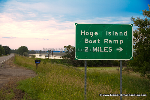
So I’ve been politely poking fun at KFYR-TV and others like my friend Mark who keep referring to “Hogue Island” online. I’ve always known the Hoge Island Boat Landing, the Hoge Field model aircraft club, and the like…so where did the U come from?

Bringing this up to Mark, he told me to “read the signs!” Always willing to double check myself, I decided to take the long way home after work and investigate. Guess what: Hoge. Look above and see for yourself. Case closed, right? Nope.

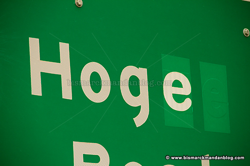
It looks like these signs have been corrected to indicate “Hoge Island” but did originally say “Hogue”. You can see from this photo where the “ue” has been covered and replaced with an “e” to alter the spelling. Did the makers of the original sign make the same “error” that Mark and others have made? Not quite…it appears there may be some actual contention on the spelling.

I was hoping that it might be as simple as looking for a Hoge Township on the Burleigh County map (PDF), but sadly that did not yield the intended result. Burleigh County itself refers to the area as Hoge Island. So how do I try to get an authoritative, definitive answer?

Well, while I’ve actually been wondering about this since late May or early June, it turns out that the Bismarck Tribune has been on top of it. They did this story on the matter back in June and discovered that two branches of the family which once owned the land in the area spelled their last name in two different ways. So we’re BOTH right. Thanks to Chris Bjorke for the legwork on this one.

I knew a guy in college whose last name is Hoag. I wonder if he’d want to chime in on the matter

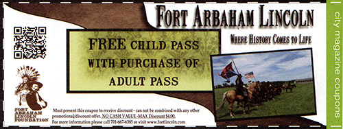
Free pass to Fort Arbaham Lincoln. Wait, what?


I was perusing a magazine last weekend when something caught my eye. I’m a speed reader and I have this disorder where typographical issues jump out at me as if I’m viewing one of those Magic Eye 3D images. Did you already spot this one?

Fort Arbaham Lincoln. Hm. Okay, so my disorder doesn’t end there. I figured perhaps there might be a legitimate use of Arbaham somewhere, so I typed “Arbaham” into Google and got some interesting results.

Most noteworthy is a book titled A Man of the People: a Drama of Abraham Lincoln. This stood out right away, so I went to Barnes and Noble’s site to see if it really was listed under that title. Yup.

Borders has this book by Thomas Dixon listed twice on their search engine. Both times it’s with Abraham, not Arbaham.

I found listings for Arbaham on Amazon, Biblio, Alibris, and others. So who’s right? All of them, sorta…

A quick search of the ISBN (International Standard Book Number) these folks are using for Thomas Dixon’s 1920 book, #9781140264811, shows a typo in the ISBN registry listing for this book. That means whoever relies on the ISBN entry as their source for correct information on this book has a problem.

Since this book is in the public domain, you can read it online for free or even download it in various formats and note that the cover page has the correctly spelled title, meaning that Borders has it right. However, since the other sites are using the “official” title of the ISBN registry, can you blame them?

Anyway, we all make little slips from time to time. It happens. Sometimes it’s funnier than others, sometimes it goes completely unnoticed for decades. While this book was written in 1920, the ISBN has only been in use for a little over fifty years. Hopefully my typographical errors and misspellings will live on in infamy as well for someone to discover later. Have a great weeekend! 😉

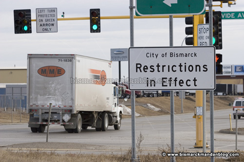
Welcome to Bismarck. Restrictions in effect. Only one catch: you may have to guess what they are

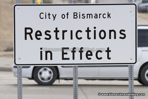
It’s that time of year again: the ubiquitous “Restrictions in Effect” signs are popping up around the periphery of Bismarck. Restrictions of what nature, you ask? If your only source of information is these signs, I suppose it’s anyone’s guess.

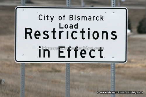
I first saw these signs go up three years ago (and every Spring since) and thought they were pretty funny. It’s because of the load restrictions on Bismarck roads, which I heard about on the radio, but the signs are vague enough to omit that detail. It’s only after someone figured out what was missing (maybe they read this blog) and wedged a little “Load” in there that the signs made sense:

This is how the corrected signs look. I was actually surprised to find an unmodified one posted up along Divide Avenue this afternoon. As you can see in this post from last March, I was almost second-guessing whether I’d even seen the signs without the word “Load” inserted. Today’s sighting of one of the original signs is a bit of a vindication, I suppose. Now someone’s going to have to dash up to Divide Avenue with another “Load” sticker!

This billboard is truly 3D

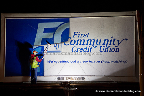
My friend Amy clued me in to this billboard Friday so I had to take a look. It’s pretty eye catching and at a killer location. At first you’d feel really sorry for the poor individual who got stuck up there to put up a sign in this bitter cold!

Of course, closer inspection reveals that this worker is either milking the clock, frozen solid, or something else entirely. That something else? A mannikin. Clever! It certainly draws the eye, anyway.

Looking back at the first photo, I think this is a good eye catcher for rolling out a new image. I just hope that when it’s revealed, it doesn’t contain another doggone leaf!

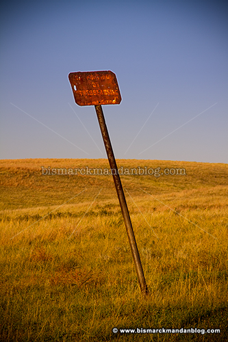
Rusty

I wonder how long it will be until this rusty homemade sign will be sticking out of a snowbank? It resides along the dusty gravel road that is Highway 1806 north of Mandan. That’s a fun road to wander on when you’ve got the time (and a camera). I made a trip up to Cross Ranch a while back to check out the foliage, but sadly all the leaves were already on the ground. It was a surprise because the leaves here in Bismarck-Mandan were only beginning to turn.

To help prove they’re out of touch with North Dakotans, Dem-NPL adopts new Hopey-Changeyâ„¢ logo

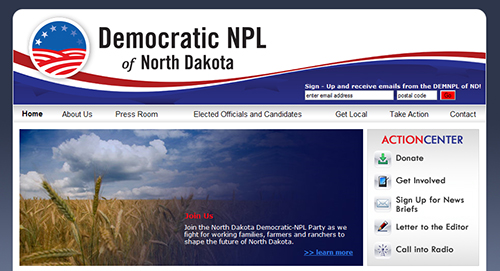
I know you guys probably don’t go to the website for the Democrat party here in North Dakota, but I got a tip on this from a friend. Visiting the site gave me a hilarious sight:
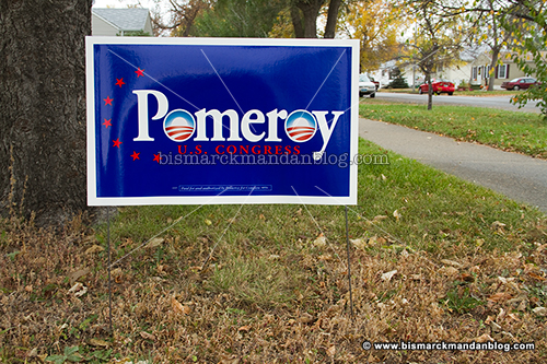
A new logo! Of course, given the line of work I’m in I pay keen attention to logotypes and branding. That’s why I have a “Signs, Logos, and Typos” category of posts here on the ol’ Blog. As I often do, I whipped together a little comparison:
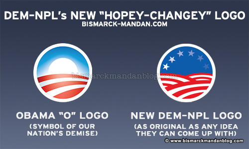
As you can see, it’s a recycled version of the Obama “O” logo, which is certain to get plenty of positive response in a state that didn’t vote for him for President and is fed up with Democrat policies in Washington…oh yeah, and who rejected Obamacare quite handily! Keep it up, Democrats! Good luck with all that recycled Hopeâ„¢ and Changeâ„¢.

Of course, if the Democrats were really so proud of their young President, maybe they could incorporate it in their campaigns. Not likely. They could have some starry-eyed kid intern run around and put stickers on all the O’s of the Pomeroy signs out there (as I’ve done in Photoshop above). After all, I’ve looked around and noticed that there are NOT VERY MANY out there. Lots of Berg and other Republican signs dot the landscape, though! But let’s go back to the Democrat Party website for a second:

Here’s a list of press releases on the home page. Apparently they’re sending Conrad and Dorgan all over the state to endorse, re-endorse, and re-re-endorse Pomeroy in the hope that something will stick. Riiiiiight. Hey, just a second…I have evidence of how well THAT is working:
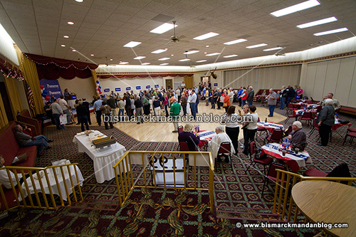
I took this photo ten minutes into an event listed on the Pomeroy website (I’ve made a shortcut for you at www.tinyurl.com/no-events, named for the year and a half in which it was left blank as he hid from his constituents). The “event” turned out to be a Democrat Party rally, with Conrad and Dorgan scheduled to attend, and you can see the enthusiasm filling the room. Nope, actually that’s just empty air filling the room. Here’s a link to the larger version, click and count the people. Considering half of them were probably staffers, it’s a pretty good show of the pathetic level of support and turnout enjoyed by Earl Pomeroy and his Democrat Party.

I had to leave for 7pm church, but I hung around long enough to see if a crowd was going to develop. It didn’t. I did get an earful of Heidi Heitkamp trying to rally the few by decrying “the failed policies of the Bush Administration.” She used that tired keyphrase so often that I was about to yell “DRINK!” on the next one. Then again, the logo proves that NEW IDEAS are not something that rattles around in the vacuous head of a North Dakota Democrat.

You can put all the logos on the Democrat (not Democratic) Party that you want, it’s still going to remain the home for displaced leftists, communists, marxists, and anti-American wackbags. Pro-abortion, anti-gun, pro-government, anti-defense, rabid-environmentalist, anti-religion…all those things define sects of the Democrat Party…an organization and ideology so out of step with North Dakota and America in general, all they have left to do is try to rebrand themselves. Now that Americans, including North Dakotans like me are paying attention, we’re not going to fall for it. Ever.

Good luck on the facelift, Democrats…see you in two weeks.

Appropriate use of space

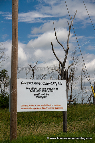
I had to chuckle the other day when I spotted this gem, since it thumbs its nose at an intrusive federal and state government. Apparently this space is off limits for advertising, so the owner decided to make it serve a good purpose. Declaring a Constitutionally protected right ranks right up there in my book!

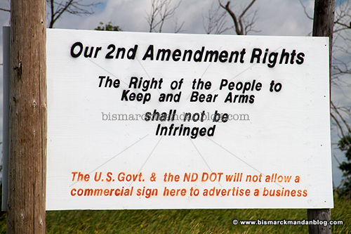
Here’s a closeup of the sign along with an explanation of why the declaration is being made. Overspray issues aside, I think this is a fantastic landmark and that there should be more of this sort of thing all over North Dakota. How ’bout that Bill of Rights, eh? I think people need to be reacquainted with it and our other founding documents. You’d be surprised how many rights the state and citizens have and how few the federal government does…