DUCK! Well, actually…Goose!

You may have noticed this sign while coming down to the Fox Island area. At first glance, it would appear that a duck crossing would be up ahead, or at least that’s the way I interpret the shape. But this area is actually a very popular nesting ground for geese. Lots of little newly-hatched goslings are getting their sea legs this time of year as mom and dad take them from the safety of the nests to the open water, and sometimes that involves a brief waddle across Fox Island Road.

Here a couple of goose families are enjoying the water along the road, which is especially high after all the recent rains. They didn’t care much for paparazzi, however, and scooted away from me as soon as I got set up along the shore line.

If you were in or around the Southport Marina this spring and happened to glance at this little island along the northern edge of the development, you were looking at a nest. Here the momma goose is hunkered down to protect her nest, despite picking one of the most visible spots in the area to build it. There are many such nests in this area, and a few locals even put up “nesting aids” in the back yards or along the water.

This area could use a “Turtle Crossing” sign as well; I remember one night when nearly a dozen of us on motorcycles came barreling down the road to stop and hang out near the Fox Island dock. Only once we’d removed our helmets did one guy from the back ask, with great incredulity, if anyone had even seen the turtle walking across our lane! Apparently everybody missed the little guy, which is fortunate; that would have caused a nasty chain-reaction accident. I’ve since pulled over on occasion to pick up a turtle from the road and deposit him on the other side of the road. For a turtle, that must be awesome acceleration!

Another local ad with Bismarck misspelled


There’s a TON of construction going on out there these days, much of it along my daily route. So what does one do while stuck at a standstill because some dork wants to turn left in the middle of a construction zone? Pull out the camera and take a photo of the misspelling of “Bismarck” in the window of the Bis-Man Transit bus in front of me, of course!

I’m pretty sure Bis-Man Transit doesn’t make the window stickers, and neither do most of their advertisers. With that in mind, I’m sure that both BMT and Firestone employees know how to spell Bismarck. As far as the ad agency or printer who made this decal…well, they need to go back to school!

This sign has been on the bus for a long time, as its Firestone Red has faded to a faint communist pink. I wonder if anyone’s told Firestone that their ad has Bismarck spelled wrong, and that they should get their advertising account credited for the blunder? I mean, if I was paying for someone to drive around town with my business name on their bus, I wouldn’t want to be associated with spelling my own city wrong. What if someone thinks it’s my fault and doesn’t visit my business as a result? It’s a stretch, but people are wacky that way. I would want my money back, or at least some free ads (with the spelling corrected, of course).

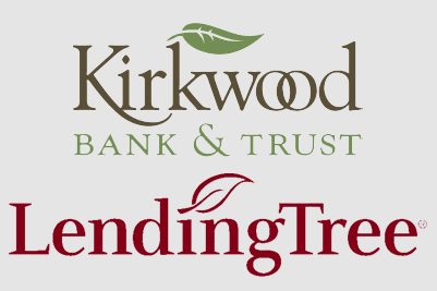
Does the new Kirkwood Bank logo look familiar?

This is the old Kirkwood Bank & Trust logo. It’s a little dated, with its bold corporate colors, so it was apparently time for an upgrade. Adding to the need for new branding is the fact that they’re no longer in their old building on South 7th Street, featured prominently in the old logo. Since they’re not going to be using that building any more, it’s time to ditch the shape in favor of…a leaf?

This is the new Kirkwood Bank & Trust logo. I’m an afficionado of branding and corporate identity, so it struck me as familiar the first time I saw it. It didn’t take long to jog the ol’ memory, and…aha! It resembles the Lending Tree logo pretty closely!

I don’t know how much they paid for their new brand, or who did it, but it seems a little close to another prominent financial institution. I don’t know that it’s close enough to cry foul, but it certainly raises some eyebrows.

This reminds me of the time NDSU wanted new branding, so they spent tens of thousands of dollars on a new logo — out of state, mind you — to come up with a new one. What was it? The letters N and D stacked on top of S and U. Wheeeee. To make matters worse, it was basically identical to South Dakota State University’s logo. Truly a remarkable waste of money, even in the context of North Dakota state government.

I wish I was good at logo design…I’m not. I’m good at animating other peoples’ designs, which works good in my current job. But if I was designing logos for a living, I think I’d try a little harder to stay clear of someone else’s trademark.

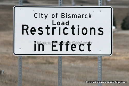
Uh oh – someone make us some “Load” stickers – QUICK

To the best of my knowledge, these signs made an appearance at each entry to Bismarck a short time ago. You’ll find them on the highways leading into Bismarck from the north and south as well as near each I-94 exit ramp. What’s funny about them is that when I first saw them, I swear they simply said “Restrictions in Effect.”

No kidding, huh? Restrictions on what? I was going to call someone at the City offices to try to figure it out, but I’ve been busy. As I left work Wednesday I noticed that they suddenly had the word “Load” tucked into the white space above the word “Restrictions” as if it had been added as an afterthought. I think it had.

I’ve been known to be wrong before, but I am quite proficient at reading road signs at speeds WAY faster than I drive where these are posted. Having seen several in a day or two, each time wondering about what sort of insidious restrictions might be implied by the sign, I would have noticed if they mean load restrictions. I think this was a big oops. Oh well, maybe that’s why designers use white space in the first place…so you’ve got room to tuck in those pesky little words that someone left out.

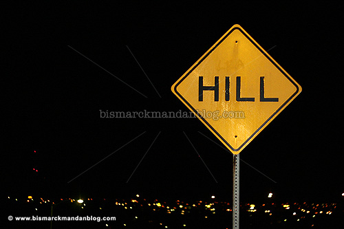
L E A – visible only at night

One of the best views of Bismarck is from atop the hills on the northeast side of town. There’s Hillside Park, which is quite popular, and then there’s the steep streets of Laforest and Northview. Northview is also known for the neighborhood which decorates all the trees in unison during Christmas, and becomes a busy street during the season. Laforest is one block over and faces more westward, providing the view you see above.

With potentially slippery conditions in the winter, the hill has always been marked by the prominent HILL sign you see above. For the past twenty years or so it has also been marked by something else: the letters L, E, and A. They were apparently painted on somehow and removed, leaving a lasting impression on the sign. They’re pretty well invisible by day, but stand out quite obviously when the sign is in your headlights (or flash).
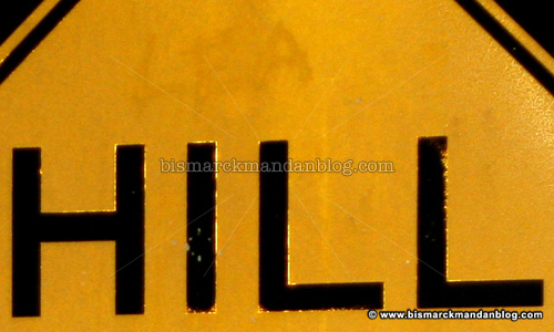
So what’s the deal with those three letters? What do they stand for, and how’d they get there? As luck would have it, I know the answer to that story. A friend of mine used to live in that neighborhood when she was younger, and told me the story when we first started spending time together. In fact, she’s quite directly involved.

As the story goes, another kid in the neighborhood a long time ago wanted to get my friend in trouble. Apparently the only way they thought worthwhile at the time was to try to vandalize this sign. They got some paint and put her name, Lea, prominently above the HILL on the sign. Naturally the neighbors all spotted it right away. Lea maintained her innocence until the truth came out.

I suppose the sign was never replaced because during the day it’s nearly impossible to see anything unusual about it. But I’m sure dozens of people who come up Northview each Christmas to see the lights, taking a right at the top of the hill to come back down by Laforest, see the letters L E A in their headlights as they pass this sign. Now you know why they’re there..

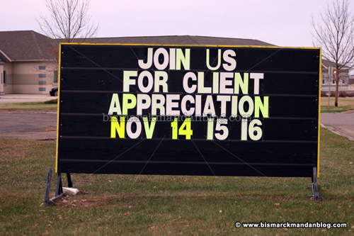
Missed it by one letter

Darn. Missed it by one letter. This sign was at Spa D’Athena, so it would have likely been quite profitable for it to read “Clint Appreciation Day.” I guess I’m out of luck…and taking the E off the sign wouldn’t get me anywhere, either!

This reminds me of a shelf of all sorts of assorted snack goodies at work. It’s marked “Client Use Only” or something like that to make sure that those treats are set aside for clients who stop in. On certain afternoons I get quite tempted to head over to that shelf with a bottle of white-out and make it a “Clint Use Only” area!

Don’t blink! Hensler

Some say it’s north of Mandan. Others say it’s west of Washburn. Yet others don’t know what in the world I’m talking about. The little community of Hensler isn’t offended; rather, they have quite a sense of humor about it. This sign sits along highway 200 between Washburn and Center.

I like when small towns show a sense of humor. I’ve never been interested in “the world’s largest fiberglass wombat” or other such gimmicks. That’s why you’ll never see a photo of Salem Sue or *shudder* the Enchanted Highway here. Some small towns like Hensler have a different way of grabbing attention, and it’s that ingenuity that I salute this morning.

By the way…I’ve been posting a lot of photos from towns other than Bismarck or Mandan lately. Why do you suppose that is? Well, as summer winds down once again, it’s important to get out and look around our fair state before the winter causes us to settle in for a while. You can get up on a Saturday morning and venture out, see lots of neat sites and have a decent meal, and yet be home by early evening. That’s important to do; anyone who doesn’t appreciate North Dakota has never tried it. You’d be surprised how much there is to enjoy even within just an hour or two of our beloved cities.

Strong spelling skillz not reqwired

This is a wonderful sight to behold…the construction of a new Arby’s on the southeast end of town! I’m an enormous Arby’s fan, so the news of a new one is music to my ears…and my taste buds.

In addition to being a fan of quality roast beef served quickly I’m a notorious proofreader and grammar/spelling nazi, and as such a person I can’t let this sign go. I can’t say that I’ve never made a typo. I spot them all the time in this blog, as a matter of fact, and then hastily correct them. When I saw this one, however, I had to point it out. Who knows…maybe “benifit” is a bait-and-switch tactic for new hires. “You mean you want benefits? Oh, no…we promised benifits! Sorry!

Then again, maybe the ran out of big yellow Es. Anyway, come soon, south Arby’s. I’ll be waiting.

Remember to look left…twice

This is the intersection of Broadway Avenue and Washington Street, by the downtown Dairy Queen and Feist TV & Electronics. It’s also the home of a new waterpark built to replace the ailing Elks Pool. By day this intersection looks perfectly normal. But, like the rest of us, it hides a quirk.

The quirk has to do with the sign on the lower right of this photo. NO TURN ON RED. That’s a really good idea because the underpass to the left makes it very difficult to see oncoming traffic. Using this logic one could make a very strong case for a NO TURN ON RED on North 7th Street where it crosses Main Avenue. Can you see past the Bank of North Dakota? I can’t…not without poking out into the intersection and blocking the crosswalk. Anyway…

Late at night, when those of us who are getting old are tucked safely into our beds, the downtown stoplights change. They don’t grow hair and bark at the moon, but they do start flashing yellow and red. This particular intersection does the same thing, turning into a STOP sign for Broadway Avenue. But if it’s unsafe to stop and go during the day, why would it be safer at night?

One could make the argument that it’s easier to see headlights coming at night than a car without headlights during the day. I say that it’s dangerous no matter what, for the same reason that 7th and Main is dangerous.

So the next time you’re out after midnight and come to the flashing red at Washington and Broadway, be extra careful! This can be a dangerous intersection, no matter what time of day or night.

Lewis and Clark passed through ND, were apparently made out of legos

Two things that North Dakotans have all certainly heard ad nauseum: John Kerry served in Vietnam and Lewis and Clark stopped in North Dakota on their Voyage of Discovery. These three steel icons have become the face of the Lewis and Clark bandwagon for the 2004-2006 commemoration of that voyage.

The response I’ve heard over the chosen icons is that they’re a little goofy, but they really aren’t that bad. They’re somewhat of a departure from the traditional Lewis and Clark icon that you see on road signs marking their trail through the upper Midwest, though, so they’re going to take some getting used to.

One little tidbit about that whole ’04 and ’06 thing. Has it ever occurred to you that Highway 1804 runs along the Bismarck side of the Missouri River, and 1806 along the Mandan side? A little tribute to the Voyage of Discovery there for you, in case you missed it.