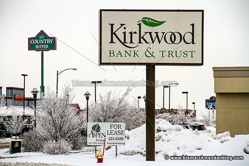
There are three leaf logos in this photo, but there’s also a leaf on the Applebee’s sign obscured in the background…and Kirkwood Bank was just to my right as I took this photo. That’s five leaves within a one block radius, a new record in my book.


There are three leaf logos in this photo, but there’s also a leaf on the Applebee’s sign obscured in the background…and Kirkwood Bank was just to my right as I took this photo. That’s five leaves within a one block radius, a new record in my book.
Favicon Plugin made by Alesis